The problem is in simplicity
The main problem in marketing of such popular and common product like sugar is its simplicity. Sugar, in fact, is the only product of its category. Whatever other food additives, sugar is always used for an equally rational purpose – just sweetening other food.
One of Minsk’s branding companies managed to develop a new company brand and logo design for the biggest sugar manufacturer in Belarus – moderately simple, catchy and pleasing to the eye.
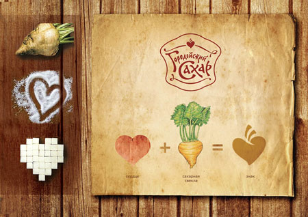
Developing a new brand style, specialists decided to pay more attention to the manufacturer, not the product’s properties – to add special quality guarantee and increase its recognizability. The renewed logo is based on a unique lettering in old Slavic style, reminding of fairs of old and trays of sweets. Additional graphic element (heart-shaped sugar beet) focuses attention on national identity of the product and its quality.
Quality of primary product and its nature, loyalty to traditions and history of the product are conveyed in a multi-layered pack – a sugar-bowl wrapped in a traditional ornamented overlay.
 The key tactics in brand design for this kind of products
is to show its national identity and quality
Source: Unipack.ru industry portal