Writing on the walls
Most people with English rattling around their heads give little thought to what their language looks like. Typeface and handwriting vanish quickly behind the meaning of the words they form. It’s a playful change of pace, then, to study the work of Noriko Maeda, whose Japanese calligraphy, on view through September at Warm Springs Gallery, dances on the border between what words and images can express.
Against the off-white background of «Heart Strings» you can almost feel the relish with which Maeda dragged a wet brush down 4‘ of paper. Background strokes the color of autumn fog provide depth as another black line curls sumptuously back into view after careening off the page. Exploring her dozen or so variants on the Japanese symbol for «play,» you can almost see the artist standing above the 9’-long table at her home near Toronto, «talking,» as she puts it, to the paper, «talking» to the brush until the moment for action arrives.
«It’s drawing, but it’s like dancing,» she said. «It’s not just writing or drawing, it’s how to move. And that movement creates headiness or lightness,» or any of the other elements that weave through her work.
In some pieces, the resulting symbols teeter on the edge of abstraction. One image in a series named «Play Like a Child» floats on a cluster of thick-streaked black rectangles that give it the look of grainy title credits in an old movie. On top, gray streaks make the ragged intimation of a symbol beside a fat drop of ink, whose short tendrils sprinted on impact from its round center.
Calligraphy’s place in modern art is especially intriguing because learning to draw the symbols requires so much discipline, obliging students to spend hours mastering each line’s exact shape and proportion. Maeda first began training in Japan when she was 10. Her paper comes from Japanese craftsmen using techniques developed in the 11th century. Yet, she can apply her skills for clients decorating modern buildings in Tokyo or procuring the graphic design services of her husband. The ancient script used in modern forms creates a contrast as crisp as the black ink against white paper.
Japanese figures carry a depth of symbolism in each brush stroke and in the meanings of the words themselves. Asobu, the title of the exhibit, means «play». It also suggests independence, liberation and life enjoyed — the concepts the artist hopes to convey visually in ways most of the written words we see every day do not. «If you can play like a child, that’s wonderful. But it’s not so easy to be free or to be spontaneous,» Maeda said. Fortunately, there’s art like hers to help us along.
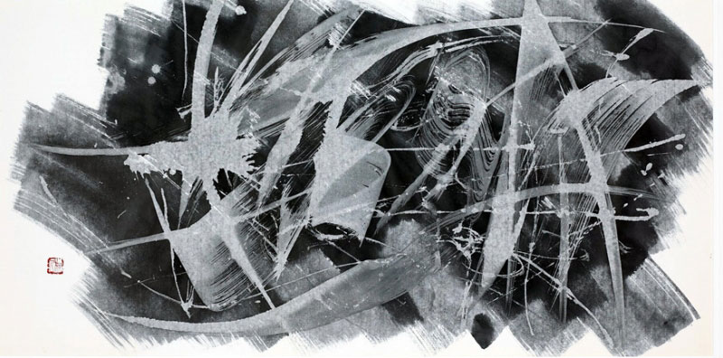 "Asobu: To Play Like a Child" by Noriko Maeda
Source: Charlottesville News & Arts