Pyotr Chobitko
Author works


")


")


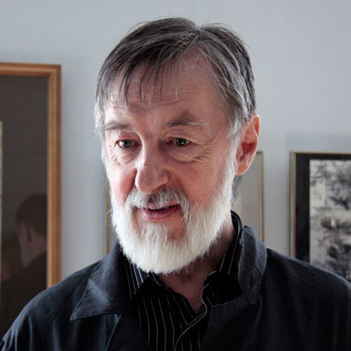
Biography

I. About the Artist
Script and Calligraphy are Chobitko’s primary area of creative and teaching activities. For him, however, it is not an abstract art for the chosen few. On the contrary, his ultimate goal is to integrate script and calligraphy into everyday life. Our lives are electrified with hectic rhythm; we are overwhelmed with supersaturated low-quality visual information, often causing stress, depression, and mental breakdown. These destructive agents are gradually undermining our personalities. Thus a healthy, self-sustaining person, that would be able to receive proper higher education and to apply her potential creatively and spiritually, can only evolve in close contact with calligraphy. Calligraphic exercises help children build up a well-balanced psyche, urging their consciousness to evolve, calibrating their emotions, developing complex hand motor function, laying foundations for a wide range of future activities. Adults, practicing calligraphy, are likely to use it as a relaxation means, a stress-relief shield, as well as to unleash their creativity.
Technological progress, in particular the computer era, has unobtrusively separated man from the art of calligraphy. Most people are not only unwilling to have a legible and beautiful handwriting but even unable to see and appreciate the true harmony of a letter sign; thus they use it without understanding its true meaning.
Yet a letter is not a petrified dead pattern but a real lively image that, in its modern embodiment, just like the human genome, has accumulated all stages of the human evolution, being an integral part of our spiritual and material culture. This is not only a means for information storage and transmission, a tool that ensures the most reliable link between people and entire historic epochs but also the realm of the most delicate emotional and psychological feelings, indulging fantasy that is expressed via letter’s exquisite elegance and virtuosic flourish.
Therefore, being an artist and a teacher, Pyotr Chobitko sees one of his main objectives in inculcating love for and understanding of the art of font and calligraphy in his pupils, as required for them to become genuine professionals and in bringing back into our everyday life the interest in, attention to and respect for our lettering traditions, in reviving the image-based origin of a letter and its sacral nature.
This master truly deserves to bear the long and unjustly forgotten name of Calligrapher. Thus, from times immemorial, were called those, who had penetrated into the mystery of the “signbirth”.
Creative work by Pyotr Chobitko started to gain wide popularity in Ukraine, in the Baltic States and abroad in the 1970s. Ironically his artworks were predominantly showcased at international vernisages and biennale, not at soviet exhibitions, including Bulgaria, Poland, Syria, Finland, Czechoslovakia, France, the USA, and the Baltic States. His masterpieces are kept in museums and collections of Tallinn, Kyiv, Warsaw, and New York.
Pyotr Chobitko was born in Kyiv in 1946.
Upon graduation from the T.G. Shevchenko Republican Art School, Pyotr Chobitko entered the Kyiv National Artistic College in 1965. His artistic carrier started in his sophomore year, when Pyotr took part in a republican young artists“ exhibition. In 1966, he was transferred to the Estonian SSR Tallinn National Artistic College, to the Chair of Graphic Art, and soon became a pupil of Paul Lukhtein, a well-known teacher, master of calligraphy and handwritten book design. While studying in Tallinn, he took part in the Republican Exhibition of Estonian Poster (1968), where he got the 1st degree diploma. He was also awarded a 1st degree diploma at the Baltic Triennale of Poster in Vilnius (1970). In summer 1969, Chobitko goes in for in-depth training at the Leipzig High School of Graphics, under Albert Kapr, a well-known professor of script and calligraphy.
The young artist was keen on all things pertaining to the art of script: books, posters, industrial graphics, and script ex-libris. His first ex-librises executed in various graphic techniques appeared in his salad days later to be showcased at many ex-libris exhibitions and to attract eminent clients, such as famous artists, cultural figures, collectors, and museums. The central piece of Chobitko’s ex-librises is the calligraphic monogram.
In 1971, under Professor Lukhtein, he performed his graduation work with honors. It included posters, font and applied graphics (a logo, a booklet, a set of stamps). In the same year, he was invited to hold the position of a senior lecturer at the Chair of Graphic Art, Kyiv National College (at present, the National Academy of Visual Arts and Architecture), in which he combined teaching of applied graphic art, font and basics of composition with scientific and creative work.
For many years, Pyotr Chobitko conducted creative workshops in font art and composition for young artists in creative houses (the town of Sednev, Chernihiv Oblast, Ukraine; Senezh lake; Dzintari Concert Hall, Yurmala).
Since 1966, he has participated in republican, regional and all-Union exhibitions and contests of poster, font graphic art, book binding and design, which enabled him to become a member of the Union of Artists of the USSR in 1974.
Within the framework of international biennales, the artist went to creative foreign trips, took part in republican and international symposiums and conferences in script and book art. In 1974/1976, he co-authored with V.A. Smirnov, his colleague from Tallinn, in designing and illustrating the Partisan Glory Museum in Yaremche (Prykarpattia, west of Ukraine).
In 1983-1986, with a group of his pupils, he executed a major order to design and decorate the Republican Literature Museum in Kyiv.
In 1985, to commemorate the anniversary of Ivan Fyodorov, Russia’s first book printer, Pyotr organized the Font and Calligraphy exhibition, featuring the works by the master and his apprentices. It was a sort of the report on the 15-year teaching and creative experience of the artist. In 1986, after the Chernobyl catastrophe, the artist fulfilled a high-level order for the Museum of Medicine: honorary diplomas and medals for Dr. Gale and businessman Hammer.
In 1987, due to some health problems, the artist went to the Altai Mountains region where he continued his creative work and teaching.
In 1992, he organized a group exhibition of local artists in the Anokhin Republican Museum (the town of Gorno-Altaisk).
In 1993, he founded a children’s school of applied arts on the shore of the Teletskoye Lake, in the Iogach settlement. New conditions enabled the artist to unfold his multifaceted talent in new directions – painting, interior design, landscape design. Dealing with the Cedar Taiga Museum Design Project, he took a chisel in his hands for the first time for wood-carving, devoting considerable time to this type of art.
While working on the museum exposition, observing and studying the environment and pondering the heartless and pragmatic utilization thereof by us, humans, he became a militant conservationist. He developed and proposed a program for spiritual and cultural recovery of the Teletskoye Lake Region, restoration of traditional crafts and development of folk crafts, environmental training of the young generation at schools. This program was adopted at the International Symposium in Gorno-Altaisk in 1991.
In 1997, as the school of applied arts became more popular, and the number of those willing to study there increased year by year, he applied his influence to have a new premise allocated to the school in order to expand the training options for children studying ceramics, artistic leather processing, decorative painting and wood carving.
In 2000, he moved to St. Petersburg at the invitation of the Empress Aleksandra Fyodorovna School of Folk Arts Director and taught calligraphy and drawing there for two years.
In 2001, he was invited as a part time teacher to the Stieglitz Art and Industry Academy in Saint Petersburg, Chair of Easel and Book Graphic Art.
Since 2002, he has been a staff teacher of font and calligraphy in the Chair of Easel and Book Graphic Art, and also taught font at other chairs of the Stieglitz Art and Industry Academy – Ceramics, Glass, Metal, and Design Chairs.
Since 2005, he has conducted his own school of calligraphy implementing his unique educational programmme.
Since 2007, he has taught at the Chair of Graphic Art at the Repin State Academic Institute of Painting, Sculpture, and Architecture of St. Petersburg.
In addition to teaching, he continued scientific and educational activities, took part in conferences, held training workshops, lectures and master classes in different educational institutions of Russia.
II. Artist’s Creative Activity:
Poster
As a student, in addition to performing work in purely graphic techniques, Pyotr Chobitko was fond of studying the complex problems of font in its close relation to the art of poster, spending considerable time on his research. The poster has a special language and a special area of font art, which requires from an artist not only a good performance technique but also deep, true understanding of a social phenomenon, the essence of which should not only be ‘extracted’ from the depth of the event but also precisely reflected using the minimum artistic means. The artist worked on political and socio-cultural poster. Whereas in political poster he often avoided using script, in socio-cultural poster he used it to express the message required.
Pablo Picasso anniversary poster: in this poster, the focus is on Picasso’s portrait made by pen. We can see the script that originally combined the portrait itself and a fragment of one of the painter’s drawings, in this case, in a free wide style typical of Picasso.
Book: “Dante” and others. Fonts:
The versatile creative personality of a calligrapher is a sort of ideal pattern for Pyotr Chobitko. The boundaries of font canons proved to be too narrow for him time and again. By thoroughly studying many of the existing forms and systems of calligraphy, Pyotr Chobitko created a series of original scripts, in which canon requirements and the author’s free creative thought co-exist organically, e.g. draft scripts for the Divine Comedy, the Baroque Alphabet; Narbut, Scythian, Skovoroda (“Frying Pan”), Baudelaire fonts etc. In this work, the artist demonstrated excellent expressive potential of new fonts, indicated the ways to consolidate calligraphy rules and standards elaborated during the centuries and creative will of an individual author.
Both poster and book design are determined, first and foremost, by the quality of fonts – the most widespread and extremely important type of graphic art. For him, it is both the social history of the sign, and the possibility, on the basis of real prototypes, to create new forms that never existed before.
Therefore, Pyotr is constantly working on the problems of font, tries to develop the legacy of classical forms, carefully restoring the ideal of eternal beauty, creating his own, modern understanding of classics.
FONTS:
Exclusively font work as well as impromptu by Pyotr Chobitko is graphic art in the pure form where expressiveness of the work is largely based on the gracefulness of the clean surface of a sheet of paper; each brush stroke, each dab of the pen involves the clean surface into the birth of the sign-image.
The technique greatly influences the expressiveness of letters; therefore, the imagery of Pyotr Chobitko’s script work greatly depends on the technique selected by the author. He willingly uses the conventional calligraphy tools — brush, pen, reed pen, ink on paper or on silk.
For instance, as far as pen is concerned, the major part is attributed to the line, the sign outline and the exquisite single stroke. Brush, with its endless variety of thick and thin lines and richness of tone, reveals the internal gracefulness of the letter.
Thus, the highest achievements and artistic traditions of calligraphers of Ancient Russia and Ukraine, Western Europe and the East, especially after a trip to Europe and acquaintance with the Japanese school of calligraphy, are synthesized in creative work of one master.
In the mid-1980“s, the artist received a high-level order – to design the emblem for the Union of Artists of Ukraine and the Republican House of Artists. These projects can be largely regarded as a successful social and artistic experiment. Draft emblems and other font work of the artist were later displayed at the first exhibition of Soviet font artists in the U.S.A. and France (New York, 1985; Paris, 1986)
In 1983, the artist took an active part in design of the Ukrainian SSR National Literature Museum, where he was in charge of all artistic and font work, on which the main concept of the museum design was based. The font in the exposition was the main esthetic pole that consolidated all of the museum halls and also different exhibits, thus connecting them into an integral ensemble. It connected the past with the present like a bridge. The opening of this large museum in 1986 became a significant cultural and artistic phenomenon for Kyiv.
A number of artists, Chobitko’s former or current pupils were involved in the project. The mere fact of font artists' team formation proved that Ukraine now had a full-fleshed school of such professionals, which would have been unthinkable a decade ago.
Pyotr Chobitko developed a corporate script for the museum, which comprised all of the best global and national artistic traditions. The letter proportions have the stoutness of academic renaissance antique; cursive elements remind of Kazak Cyrillic cursive handwriting, and typical serifs and letter outlines testify to the development of G. Narbut’s script search on a modern basis. All of these attributes represented the original artistic phenomenon in Ukraine of the mid-1980“s. Such experiment proved the fundamental ability of the font to shape the esthetic environment on a large scale, to influence the perception of many people, and this it was an expression of the synthetic form of public conscience, the name to which is art.
PASTEL, ETCHING:
Pyotr Chobitko is the author of many lyrical landscapes made in crayons and wax crayons. As a rule, there was not a single exhibition without his work, in which he passionately used different graphic techniques. His etchings were displayed at all-Ukrainian republican exhibitions.
In 1970-80”s, Pyotr Chobitko experimented extensively, combining high printing with deep printing (linocut with etching) in graphic sheets. The subjects of his work are very diverse: anti-war, topical composition, landscape, and still life.
Whereas the artist tries to summarize his own experience of working on problems of font composition in a book or in a poster, painting and graphic work reflect his inner experience accumulated in communication with the nature. Both theoretical generalizations and their practical implementation constituted the methodic base of teaching the font art at the Kyiv National Academy of Fine Arts and Architecture where Pyotr Chobitko developed and implemented such subject as the Basics of Font Composition and the Basics of Font Graphic Art.
Following the example of his teacher, Paul Lukhten, in his creative work the artist is constantly looking for a connection of letter and material, embodying it in different graphic techniques and materials. Such well-known sculptors and architects as Vasily Borodai, Anatoly Ignashchenko, Ivan Makogon, and Mikhail Gritsyuk invited him to cooperate to make font compositions, inscriptions on medals, memorial plaques and monuments.
The artist is working with interest in book binding, which he mastered in the Tallinn College. Performing numerous orders for leather bindings for books, address folders and cases, he was able to gradually arouse interest in a number of students and colleagues and thus laid the foundations for establishment of the Binding School at the Kyiv National Academy of Fine Arts and Architecture, which later contributed to revival and development of the binding art in Ukraine.
ALTAI CYCLE:
In 1987, the unquenchable thirst for traveling and cognition of the environment led the artist to Altai, to the shores of Lake Teletskoye. This unusual and original corner of the earth will always remain one of the favorite and dearest places of the artist’s creative work. Impressed by the inimitable natural beauty and meetings with different people, he returns, again and again, to his favorite water colors, crayons, pastels, and devotes a large cycle of his artistic, graphic and calligraphic work to this mountain area and its people.
AUTHOR’S WORD:
The image of the Letter, its qualitative and esthetic aspect is extremely significant for a human being. The image of the Letter is imprinted in our conscience, invisibly influencing on the finest structures of our psychological and emotional sphere; therefore, the force of its influence may be both creative and destructive. The nature of this Image will depend to a large extent on the creator – the breeding of his artistic and aesthetic taste, erudition, and, finally, moral standpoint.
Calligraphy studies require considerable effort, but their fruit are invaluable for both body and soul. During calligraphy studies, your hand acquires the ability to perform the most delicate work, and your eye becomes sensitive to details and shades to such extent that it is able, as a good critic, to control this process and to timely notice an error. By overcoming laziness of the soul and inertness of thought, a human being becomes more observant, can concentrate better and think consistently and logically, which, in turn, promotes development of creative thinking and imagination.
Calligraphy studies have a positive impact on psychically and emotionally unstable people, helping them make their inner state more harmonious and to attain peace of mind. It is especially topical in our modern world, with its inexorable speeds, when the destructive pressure of the external environment is on the rise. To preserve the integrity of soul and body under these conditions, each of us needs an effective cure that we can make ourselves based on the prescription time-tested by our ancestors.
Through the world of calligraphy, each person will be able to discover different horizons of the external and internal environment. If you take a pen or a brush into your hand for the first time, it is important to always remember the old masters” testament: the harder you polish a letter, the harder the letter is polishing you.
Fragments from publications about the artist in different periods of his creative work used:
articles of art historian Viktor Kostur (Kyiv), fragments from newspaper publications: Molodaya Gvardia, 1.03.74р., Zvezda Altaya