Traditional Hebrew calligraphy swirls into cutting-edge font
Avant-garde graphic artist endeavors to salvage the ancient Jewish art from its religious image.
The graphic designer Oded Ezer finds Hebrew letters exciting. His feeling for the building blocks of the Hebrew language explains how he, a self-proclaimed avant-garde artist known for stretching the boundaries of typography beyond the narrow confines of writing and into the realm of art, began to connect to the ancient art of Hebrew calligraphy.
A month ago, his experimental work currently on show at New York's Museum of Modern Art received a rave review in The New York Times. One of the pieces imitates human reproduction, and creates a seemingly impossible combination between nanotechnology and Latin letters.
 Oded Ezer
But it is rather the movement of quill on paper that inspires Ezer to speak sentimentally. At his south Tel Aviv studio, he performs his exercises for the introductory calligraphy lessons he is taking from a young religious graphic designer proficient in Hebrew religious calligraphy. These lessons provided the foundation for the new letters he developed on the computer, based on the hand movements used in writing calligraphy.
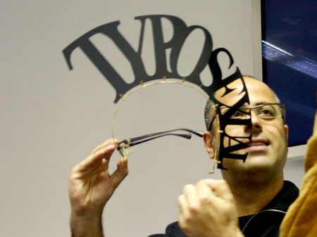
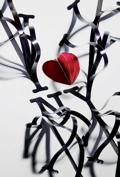 “I ❤ Milton” poster
Perhaps it is Ezer's nature to seek perpetual novelty that drives him to look for it even in an old art that has gone out of fashion. But other contemporary graphic designers, the sort who work in the very heart of the commercial mainstream, have recently discovered Hebrew calligraphy, that art of traditional decorative writing, and are starting to salvage it from the religious image attached to it. This is surprising, because if there is anything that resonates less with the trendiness, commercialism, and frenetic pace represented by the world of advertising, it is sofrei Stam, or Jewish scribes, hunkered over an ancient parchment and writing laboriously with an ink quill. Ezer, who has made a career of the peculiar hybrids he creates from creatures found in nature and letters, thinks that religious scribing should be taught at all the higher education schools of design.
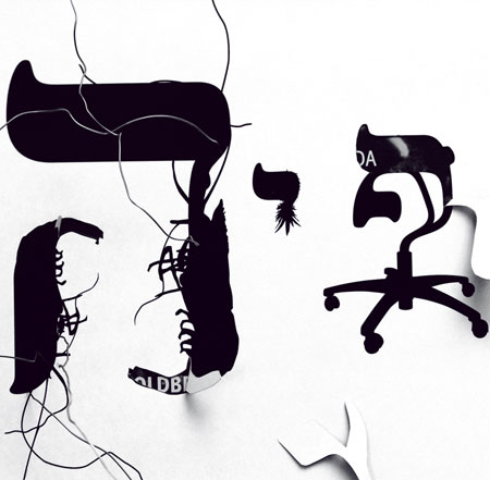 Tybrid (detail)
“I want to make revolutionary things that are planted good and deep in our history”, he says.
Holon Institute of Technology opened a Hebrew calligraphy course this year, taught by Eliyahu Misgav, Ezer's religious calligraphy teacher.
Yehuda Hofshi, a graphic designer who coordinates typography studies at HIT and also teaches at Bezalel Academy of Arts and Design, thinks the interest in calligraphy is unrelated to the current spirituality trend, so prominent today in Israeli music for example. In his opinion, it represents secular thinking about the identity of the Hebrew letter, and even about the identity of the Israeli cultural and social space. Nothing less.
Hofshi maintains that renewed interest in calligraphy stems from the revolutionary appearance of new communication media in the past 15 or 20 years. These created an immediate need to develop new fonts for commercial use, he says, bearing in mind that “not every font is suitable for computers or television”. Furthermore, Hofshi adds, designers in the global village are more aware of the endless variety afforded by Latin letters. Hofshi believes that typography, the art of designing letters, is intimately connected to culture and society, just like language in general: Developing Hebrew letters cannot be severed from their history, which is the history of the Jewish people.
“People see fonts as something cosmetic and trendy”, Hofshi says. “Today I feel like using this, tomorrow that. But unlike other cultures, the Hebrew letter has been preserved continuously throughout Jewish history. It is the thread linking the Jewish diaspora, and was viewed in the Zionist process as an important tool in formulating Jewish and Israeli identity”.
“Hebrew letters are coded signs with a very high degree of abstraction. The 'Aleph' for example is a symbol composed of three lines that won't mean a thing to someone who does not know Hebrew. But for us it carries so much information. And that's even before we get into its spiritual significance”.
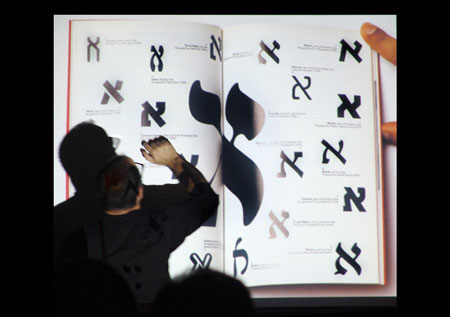 Aleph
AlephUp until the 1980s, calligraphy was taught at Bezalel as part of typography studies, but with the advent of Macintosh computers, which gave graphic artists the keys to design heaven, that subject vanished. Macintosh computers cut out a lot of steps, and made typographic plenitude widely accessible. That created a wave of abundance, with repugnance in its wake. And that, in turn, led new designers in the '90s to research the sources of fonts and explore in depth the connections between letters, the right balance between them.
Hofshi, Ezer, and Misgav believe it is impossible to create a “correct font” — harmonious and readable, with proportions that are maintained naturally in writing — without knowing all this.
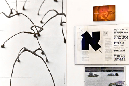 Studio wall
Source: www.haaretz.com