Calligraphers still going against type
In a fast-paced world dominated by computers, these masters of handwriting continue to make art from letters. For them, the pen is still mightier than the keyboard.
The black ink on DeAnn Singh’s fingertips is almost indelible. It’s an occupational hazard, and she’s slightly self-conscious about it as she sits down at her desk. Today she is titling the pages of a scrapbook that belongs to Barbra Streisand.
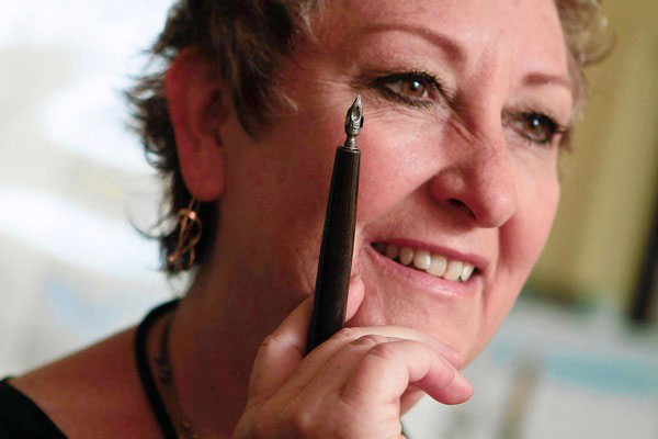 DeAnn Singh
Singh is a calligrapher and modest enough to be flattered by the appelation. Scrapbooks, wedding invitations, even thank-you notes are staples of the trade, but occasionally she’ll land a job that’s more ambitious — when a Hollywood director wanted a letter to appear as if it had been written by Queen Victoria, she took the call. When a television producer asked for a book to look as if it had belonged to witches, she was hired.
Singh has been practicing her craft for more than 30 years and is fluent in nearly 20 formal lettering styles. Keyboards may dictate the terms of the written word, but Singh’s hand lettering is a reminder that words are not just a means of communication, items of sheer utility, but personal expressions of beauty and persuasion.
«Calligraphy is an art; typing isn’t,» she says. «When you see letters that have been handwritten, you make a connection that doesn’t occur with type. Hand lettering leads to a broader, richer relationship to language.» But in a world bent upon frugality and speed, calligraphy is becoming a marginalized skill, more of a hobby than profession.
The calligraphy class that Singh taught for 25 years at the Beverly Hills Adult School was recently eliminated for lack of funding, and in April the Indiana Department of Education issued a memo emphasizing «keyboarding skills» over cursive writing for third-graders. Many calligraphers credit early writing lessons for inspiring their interest in letters.
«Computers have corrupted everything,» says calligrapher Thomas Ingmire of San Francisco, the participant of the International Exhibition of Calligraphy. «The loss of handwriting is the tragic and, to my mind, the logical consequence of the computerization.»
To be in Singh’s company when she writes is to fall under the spell of the alphabet, the straight, circular, and intersecting lines whose interplay becomes shapes and whose shapes become words.
Calligraphy — «beautiful writing» — employs a variety of lettering styles that are distinguished by a combination of thick and thin pen strokes and ornamentation. Beauty, in the eyes of calligraphers, lies in the proportions of letters and their arrangement on the page.
Some styles — Roman, Uncial, Carolingian, Gothic — date to the Middle Ages and earlier. Others, like Nueland and Legende, emerged in the last 100 years. Each follows a strict set of aesthetic principles. Roman capitals, for instance, calls for the A to be three-quarters as wide as it is tall, the B to be half as wide as it is tall and the C seven-eighths as wide as it is tall.
Designer and graphic artist Milton Glaser sees the writing as a performance. «The best calligraphy comes gracefully, without thought,» he says. «It is like dancing. It is governed by rhythm and intervals.» As a child in Utah, Singh always doodled letters and traced the cursive type in advertisements like Cadillac’s. After college she decorated cakes and wrote produce signs for Safeway.
In 1977, she moved to California and got married. Two years later, she took her first calligraphy class in the adult education program at Venice High School. It was a time when homespun arts like macrame and ceramics, spinoffs of the hippie aesthetic, were thriving.
At night, after her children had gone to bed, she practiced her letters, losing track of time as she tried to get the curve of the italic lowercase A just right. She spent a year mastering a Xth century script and then applying it to a version of «The Ugly Ducking,» which she illustrated.
«For the first time in my life, letters became a part of me,» she says. She began teaching, and for three years in the late 1980s she made scrolls for the county.
She started to get work from Hollywood: For the 1996 occult-horror-slasher movie, «Sometimes They Come Back... Again,» she created the devil’s diary.
«Devil-worship movies,» she says, «are good for calligraphers.»
She was asked to make the title page for «The Book of Shadows» in «Charmed.» For «National Treasure: Book of Secrets,» she researched and mastered the handwriting of George Washington, Queen Victoria, John Wilkes Booth, James Garfield, Grover Cleveland, Harry Truman, and Calvin Coolidge.
When the producers of «Mad Men» needed a note in cursive and a signature from Don Draper, they turned to Singh. «Something masculine and from the 1950s» was the request, though they eventually decided that the missive be typed.
Singh rolls her chair up to the slanted desk. On her left is a taboret for inks and watercolors; on her right are the cabinets for paper and finished work; and behind her is a tool chest packed with knives, rulers, markers, brushes, pens, acrylics, scissors, and pencils.
Ask her about computers, and she’ll tell the story of Steve Jobs.
Before the founding of Apple and the development of the Macintosh, Jobs dropped out of Reed College and studied calligraphy with artist Lloyd Reynolds. If he hadn’t taken that class, he had said, personal computers might not have come with a variety of fonts.
Today there are hundreds of thousands of downloadable fonts, some as easily pirated as music. A few have been created to resemble calligraphy with slight imperfections.
«When you use a font, you lose the spontaneity,» says graphic designer Jill Bell. «Letters lose their life. They look stiff and more formal.»
The reason, Bell explains, is that when fonts are designed, each character — or glyph — is constructed inside a modular box, a framework that provides the designer with guidelines for spacing and proportions.
«Each letter has to conform and sit on a line,» she says. «Each has a ceiling and a wall around it.»
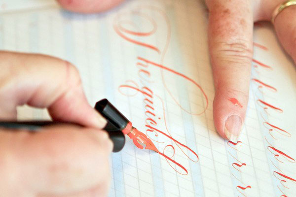
Singh opens the leather-bound book with «Barbra» embossed in gold on the cover and brushes the pages to get a feel for their texture. She puts a drop of distilled water on a small disc of gold paint, fills a basin with tap water for keeping her pens and brushes clean, and begins writing.
The lettering is Carolingian, the style that emerged in the IXth century at a time when the written word in Europe had grown nearly illegible. Her pen — a 2-millimeter Brause — moves with uncommon grace.
As she writes, she pictures the letters that lie ahead, so her hand has to trace only what she has already seen in her mind.
«It’s like basketball,» she says, referring to players at the free-throw line. «When your hand does what you brain asks, well....» She pauses, not certain at first how to finish. «It just feels right.»
After years of practice, she has memorized the muscle movements for each letter. Some take special dexterity; the letter S is especially tricky. It requires knowing where to start and stop the stroke, how to draw the reverse curve and express the letter’s inherent sensuality.
 The ink on her hands is almost indelible
Source: Los Angeles Times